Golf & Goblins Post-Mortem
Golf & Goblins is a 2D side-scrolling golf-styled platformer made in 2 weeks for Itch's My First Gam Jam. This is my post-mortem where I will mainly focus on the design choices made throughout the project.
What went right / What was successful
My goal for the project was to create a fun game that I would be proud of; I hopefully achieved the former and definitely the latter. This will be an exploration into some key design decisions that contributed towards that.
Simplicity over complexity
Time was of course a factor in the game's simplicity, although there were also a lot of conscious design decisions. The clean aesthetic helped make the game more instantly recognisable. The minimal artwork was also a reflection of my artistic style, with clean lines and simple flat colours. In terms of the UI, I wanted only the necessary information to be shown on screen, so things like numerical distance to hole and a power percentage were omitted, preferring to go with a more visual and subtle approach. Alongside the visual appeal and less cluttered screen, one functional reason for their absence is perfect knowledge isn't always a good thing. I didn't want levels to be 'solvable' in the sense that a specific shot angle and power may always result in a hole-in-one. For me, that sense of unpredictability leaves room for exploration and is one of the biggest strengths of physics-based games like Angry Birds.
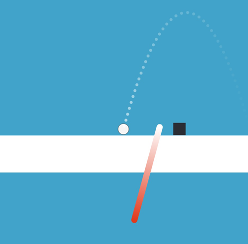
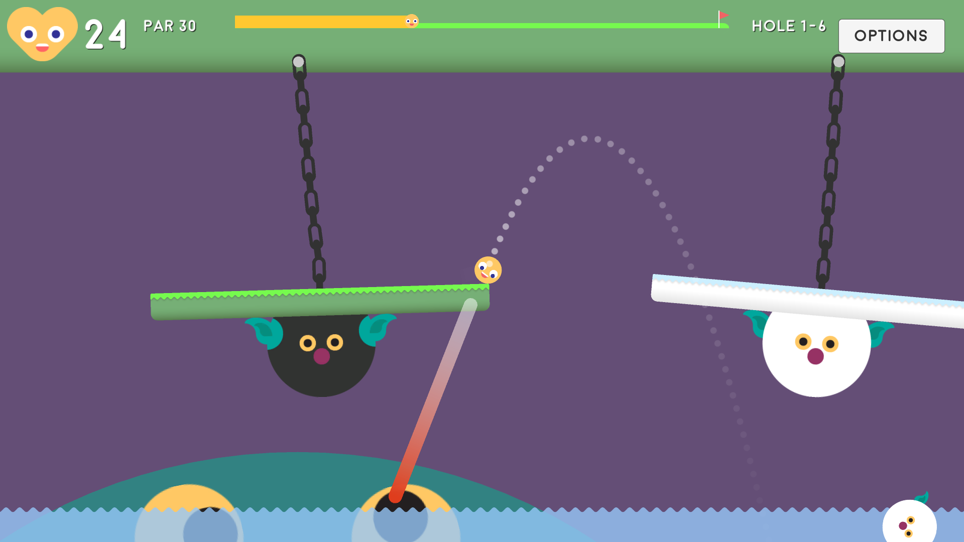
Similarly, the game's simple mechanics were designed to make the game easy to pick up and play. Full mouse controls were used to make the gameplay intuitive and accessible. The design of the aimer itself was also considered when attempting to create a clean interface. Most notably, its transparency is inversely proportional to shot power. This was due to the aimer being of far less importance for weaker shots, this frees the screen up more to focus on the actual situation and surroundings.
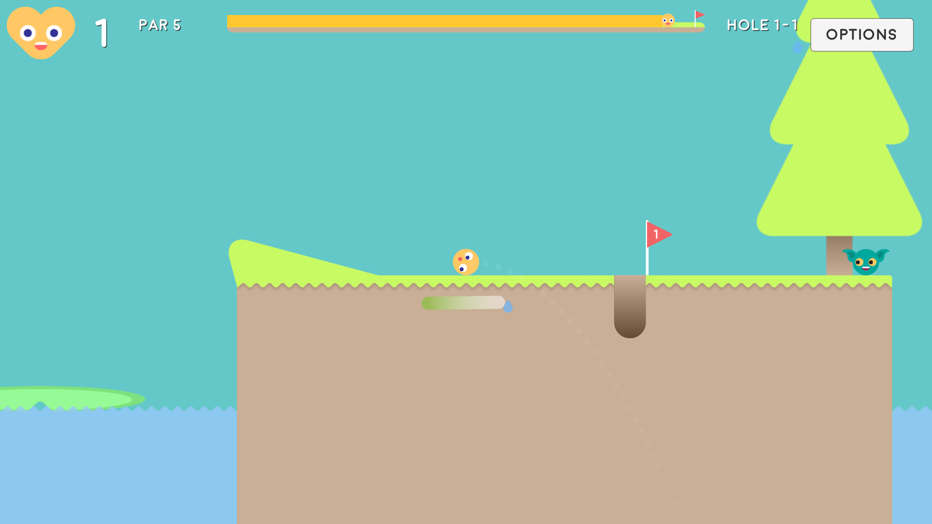
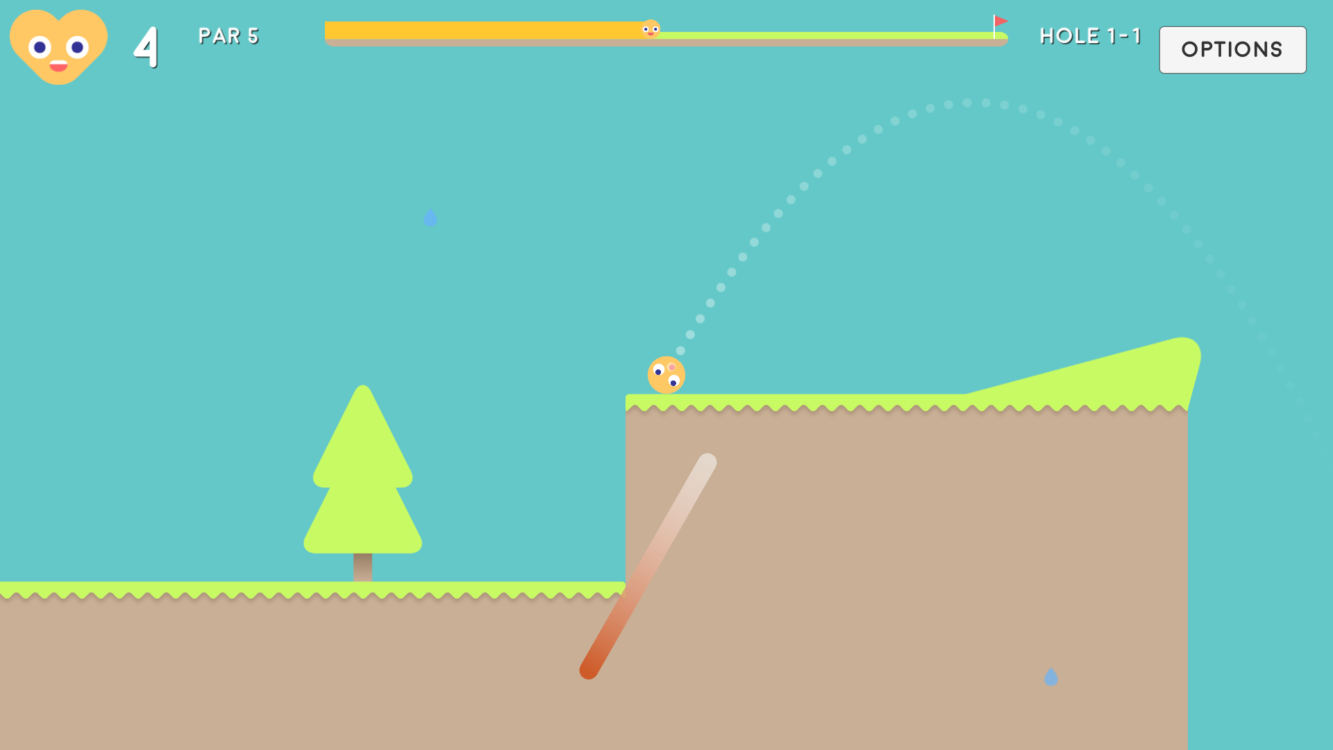
In terms of function, the end of the aimer also gradually fades out to invisible. This approach mimics the realism of shot accuracy and increases the skill of judging shot trajectory.
The power gauge transitions from green to red depending on power for a quick visual indicator. Also, below a certain threshold releasing a shot doesn't hit the ball, but functions as a secondary cancel (alongside RMB). This is indicated by the main section being removed entirely, which helps the player know exactly when they won't be wasting a shot.
Striking the right balance between golf and platformer
It's not a perfect comparison, but I also looked at this as a balance between realism and fun. At its core, the game's mechanics and physics-based nature leaned more towards golf, so a lot of design choices attempted to make the game look and play more like a platformer to make it feel more unique.
The initial decision to make a golf game was relatively quick, as I knew the basic premise was achievable to make a simple, fun game within the deadline as I had some experience working with Unity's physics system from previous prototypes. The choice between 2D vs 3D was also very simple; given my digital design experience as well as product design background I knew making art assets would be smoother and a lot less hassle than creating or even sourcing various 3D models.
The next big decision was which perspective to work in. Although a top-down view could've made a nice mini-golf style game, side-scrolling seemed like the natural choice for this specific blend of genres. I also felt there was more design space to express creative ideas with a traditional side-on view.
One simple solution to an increased association to traditional platformers was to lean on classic features from the granddaddy of the genre, Mario. Examples include the stage formatting, 1-1, 1-2 etc. as well as the choice of decreasing lives instead of going for a standard golf shot count. This approach makes it feel more like a character instead of just taking golf shots and adds to the feeling that levels must be completed within the set par otherwise the level restarts. The hole ending sequence is also influenced by Mario with the lowering flag, fireworks and fitting expanding/shrinking pinhole upon level enter/exit. The final obvious comparison to platformers would be the inclusion of level objects, covering both enemies, as well as platforming obstacles like trees and bouncy springs.
The embodiment of this balance was perhaps the choice of allowing the ball to be hit while moving. During playtesting it ultimately felt a lot more fun, giving the player more control whilst it makes the game more unique. Without this feature the game would've been too similar to many other golf games and could've resulted in an experience feeling more like a physics simulation than a playground to directly affect. The most appropriate example would be the ability to carry out small jumps over enemies whilst moving, without that ability the game would most likely not feel like a platformer at all, but a more generic golf game based in a wacky world.
Going further, it introduces more depth to the gameplay and creates room for more advanced shots and routes through levels via creative use of momentum and interactions with level objects. An example would be jumping across lily pads on top of the water's surface. Due to their physical properties they wobble upon contact, often requiring a fast follow up shot to successfully navigate. An inability to do so would result in many of the interesting physics-based objects and puzzles needing to be removed or heavily simplified. One important example of this is with level 5 where the wind continuously pushes the player backwards. These types of levels probably wouldn't be possible without the ability to shoot while moving or would require numerous 'safety nets' that could detract from the straightforward gameplay.
Finally, there is a circle collider buffer lying outside the player sprite which allows the ball to be hit whilst slightly airborne. Once the ability to shoot when moving was finalised it became slightly frustrating to also have to wait to be in perfect contact with the ground to take another shot. This was due to the player, as well as most of the objects within the game having a fairly high bounciness property.
By adding a tiny bit of leeway for actual contact gameplay felt smoother and more natural, it opened up further room for creative shots and once again made it feel more like a platformer. Now, not only could you jump over one enemy whilst moving, but two in succession if timed well. Overall, it's safe to say a better game feel was prioritised over realism.
Giving the game character
Making Golf more than just a golf ball.
One important way to make the game feel more like a platformer was to make the character (aptly named Golf) feel alive. Firstly, moving away from traditional golf ball white allowed the eyes to remain white which really helped the overall look. It also helped differentiate the character colour from things like the UI, mouse pointer and made it more distinctive from several objects, especially on snowy ice levels. Yellow seemed to fit nicely for a friendly main character; other options looked less natural, clashed with certain game objects or were stereotypical enemy colours.
I made initial sketches with arms but they felt unnecessary and clunky, a face seemed like it could be enough, although I felt animating several expressive facial movements would be too time consuming. I decided a good compromise would be to cycle through a set of standard expressions based on certain criteria such as current velocity.

I felt like this system was an instant success, but was still lacking personality as the eyes remained motionless. Achieved through coding, Golf's eyes now look towards the hole, which is both fun and functional, offering a subtle indication for which direction the player should travel. Similarly, the enemies' eyes are focused on the player.
When stationary, Golf's eyes will rotate as if waiting patiently to be hit, if above a certain height his eyes will switch to looking down towards the ground. Finally, while aiming, Golf will look at the power gauge as it builds up as if he's watching to see how far he is about to fly. All in all, the facial expressions were a small feature, but had a big impact on the game's identity.
Building a world
Building on making the ball feel like a character, the encompassing world also needed to have personality to form an exciting game.
For ground types, grass and sand were obvious inclusions, whilst ice provided a nice contrast with a friction-less surface. With the sand, I was able to achieve a nice realistic halting of momentum by applying angular drag to the ball upon each contact. However, that didn't quite feel like enough, as shots could still be shot at the same power as from grass. I took inspiration from many popular golf games like Mario Golf to limit the max power when in a bunker which felt suitable. There was also an option to apply an accuracy penalty when in a sand bunker, but that didn't seem appropriate for the 2D platformer style. The power restriction was already a big enough downside to being in the bunker.
Water was trickier to establish, as I had initially envisaged a much simpler and common approach, with the ball sinking and causing death. During prototyping only surfaces with the 'ground' tag could be hit from. At one point I decided to test shooting from water and it felt interesting right away. It was intriguing how the character would continue to fall and be impacted by the water resistance (linear and angular drag). It was reminiscent to the underwater levels in Mario and again helped to lean further towards the goal of feeling more like a platformer with a character that can control his own actions. Another consideration was the fact that being in the water was already a downside, the resistances and slow sinking really impact shot power and accuracy. Hopefully, it acts as a pleasant surprise for players who may have expected to die from hitting the water and could be explored further in the future I.e. underwater sections/levels.
The levels then needed to be populated with objects, starting with ground and ramps. Due to time limitations, I had to settle with mostly flat ground so needed a way to quickly build levels without creating custom sized sprites for any given situation. I learnt about Unity's fantastic 9-slice feature which essentially made the ground sprites infinitely scalable with no pixelation by repeating a congruous middle section. Other than ground objects, levels included trees, lily pads, pyramids, along with bouncy objects like springs and parasols that all provide interesting obstacles that can be either helpful or hazardous.
The final piece of the puzzle was adding enemies to the game. In all honesty, there wasn't much exploration, somehow the name Golf & Goblins jumped into my head at an early stage so the process worked backwards in a way. The main decision revolving around the enemies was whether the game would have a health/damage system. I originally imagined a lack of damage penalty wouldn't be a great enough deterrent for dodging enemies, but in practice they proved to be troublesome moving hazards that often impact your score if not avoided.

I think the most successful aspect of the Goblins is the variety and visual distinctiveness between them. There's green stationary goblins, pink goblins who follow the player and blue jumping goblins. Then, there's also different sized goblins, including bigger goblins, snowball goblins and of course Blingo the King Goblin. These larger enemies have greater mass values so are tougher to knock back, which often diverts the player from their intended course. Overall, I think the Goblins were a success and serve as fun moving obstacles for the player to manoeuvre.

What went wrong or could've been improved
I'll preface this section by saying that most areas of the game could be improved and were designed and/or created rapidly due to the 2-week Game Jam deadline. A lot of that was due to my inexperience in coding. Apart from that, I am looking for areas of weakness in the game itself, as well as the overall game development process to see what could be improved in the future.
Starting with the shooting mechanics in more detail, it took a full week to get a prototype to a satisfactory level (including the UI). As I wasn't 100% certain on how to code it, it involved a lot of hacking and slashing until it worked, this was of course a very inefficient process. The trickiest part was the aimer, which involves trajectory prediction which by all accounts is notoriously difficult to perfect in Unity. I tweaked values until the ball landed as close to the predicted path as possible through laborious trial and error. Hopefully it's not noticeable when playing as it does seem to be fairly accurate, although I do wish it was 100% accurate. Going further, the trajectory predictor also doesn't account for initial forces or drag so is not accurate when moving and doesn't take wind into consideration; I would at least want the aimer to account for current movement velocity in the future.
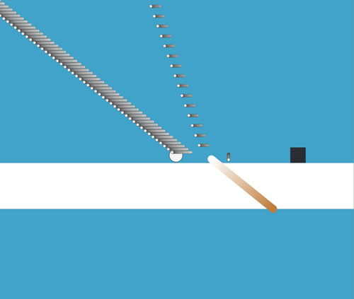
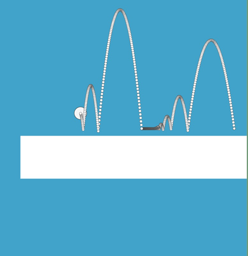
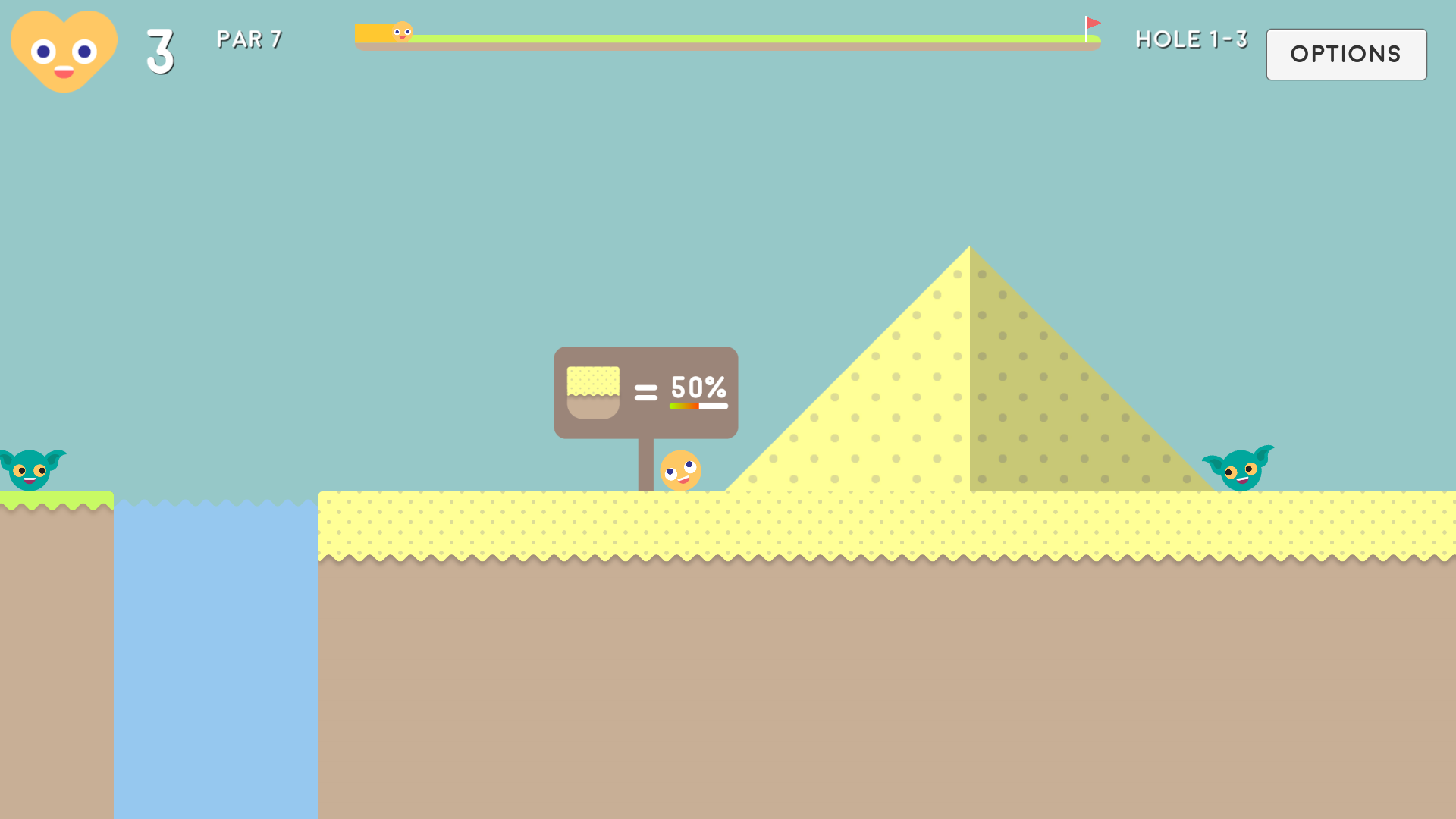
In similar fashion, I also implemented a maximum power restriction onto the shot power on the final day which in hindsight was risky as it could've possibly broken the code. I didn't have time to adjust course difficulties after that so the sand-based levels in particular turned out harder than anticipated (based on feedback I have received from a few players).
This was especially true for players who didn't realise shots could be dragged with the mouse anywhere on screen, not just directly on the ball, so they were being hindered by the bottom of the screen and not shooting at full power. I have since added a note to the controls that tries to clear this up more, but ideally there would be a simple tutorial at the beginning of the game that makes it perfectly clear. Alternatively, a quick visual guide within the controls would perhaps be easier to take in.
In terms of the level design, one thing I wasn't quite happy with in regards to the gameplay was the general overpowered method of shooting at around 45 degrees at close to full power and hoping for the best. I would probably look to redefine the maximum power altogether to make it more based on skill than luck, making it more nuanced. Another way to solve this issue could be to add more objects in the air, such as flying enemies, platforms and ceilings. That would also increase the need for planning over a more hit and hope playstyle. A more radical approach would be to link levels together so worlds/courses would need to be completed in succession which would reduce the luck factor considerably.
Similarly, the levels were perhaps too bland in retrospect. This could be rectified with more level variety, such as bunkers sporadically placed within levels more than the current way of separating grass and sand levels entirely, which almost defeats the purpose of sand as a hazard. In terms of more crazier levels, moving platforms would be interesting when planning shots and water could be incorporated more into the gameplay i.e. underwater levels.
In terms of the ground itself, the game felt too plain with flat ground planes. Ground game objects were predominantly constructed using primitive shapes for colliders to lessen the need for creating polygon colliders for more complex structures like trees. One of the biggest changes I would make to the game would be more curved ramps, hills and bumps. I think that would suit the game very well considering a large part of golf is having the ability to predict travel distance across non-uniform terrain.
Finishing touches
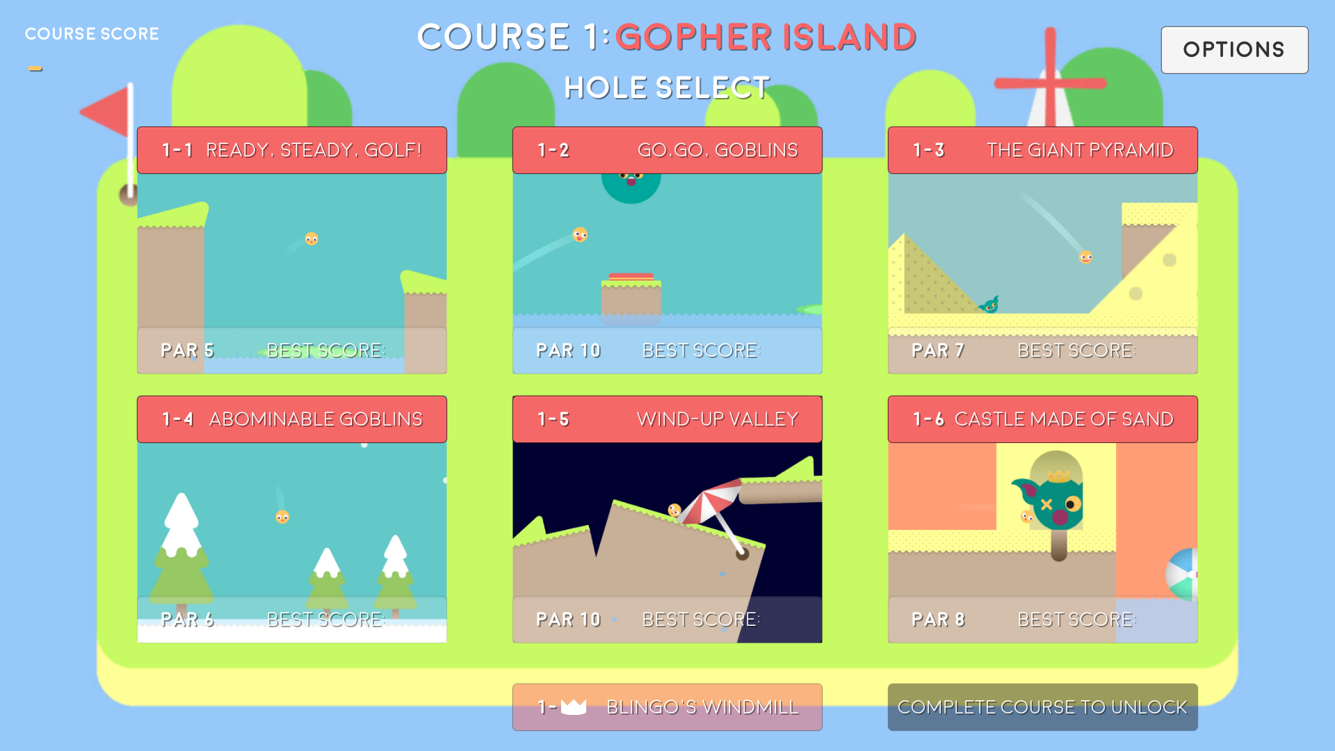
Initially I envisaged the level selection to take place on a world map just like in Mario, with the character moving along from stage to stage, the difference being that each hole would be a short top-down mini-golf minigame. Ultimately, I did not get around to implementing that feature and am happy with the simple stage select, but I would definitely explore this more in the future.
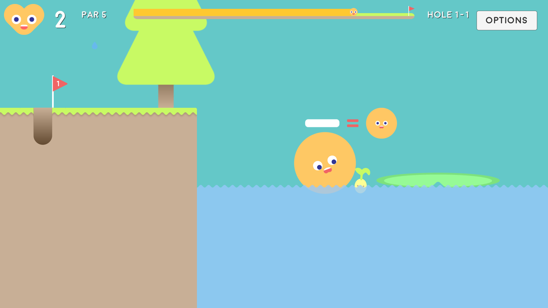
Another option I had planned through sketching was a selection of power-ups. Ultimately, I didn't feel like they were absolutely necessary so decided to cut them, but for a full game I would most likely include them to increase level diversity. I did include one in the game however, with the ability to expand the ball, allowing the player to float in water. This ability wasn't quite utilised to full effect so I decided to convert it into more of a fun (not so hidden) secret to discover. The ability is taught to the player by this helpful little seed found in a couple of levels:
Although the weather effects are pleasant, they don't move perfectly with the camera at speed. The backgrounds themselves are simple gradients with no real scenery or atmosphere. I would look to learn how to incorporate parallax scrolling for a future release to make the game more visually appealing.
Finally, with the game being part platformer, the game may lack a story, something that makes the game feel more like an adventure than a simple puzzle golf game. My original plan was for the game to be a quest to find your putter, with each world ending with a character saying "Sorry Golf, your putter is on another course". Possibly a bit silly and over-the-top, but for a full release that simple story plot could be quite interesting to give the game some meaning.
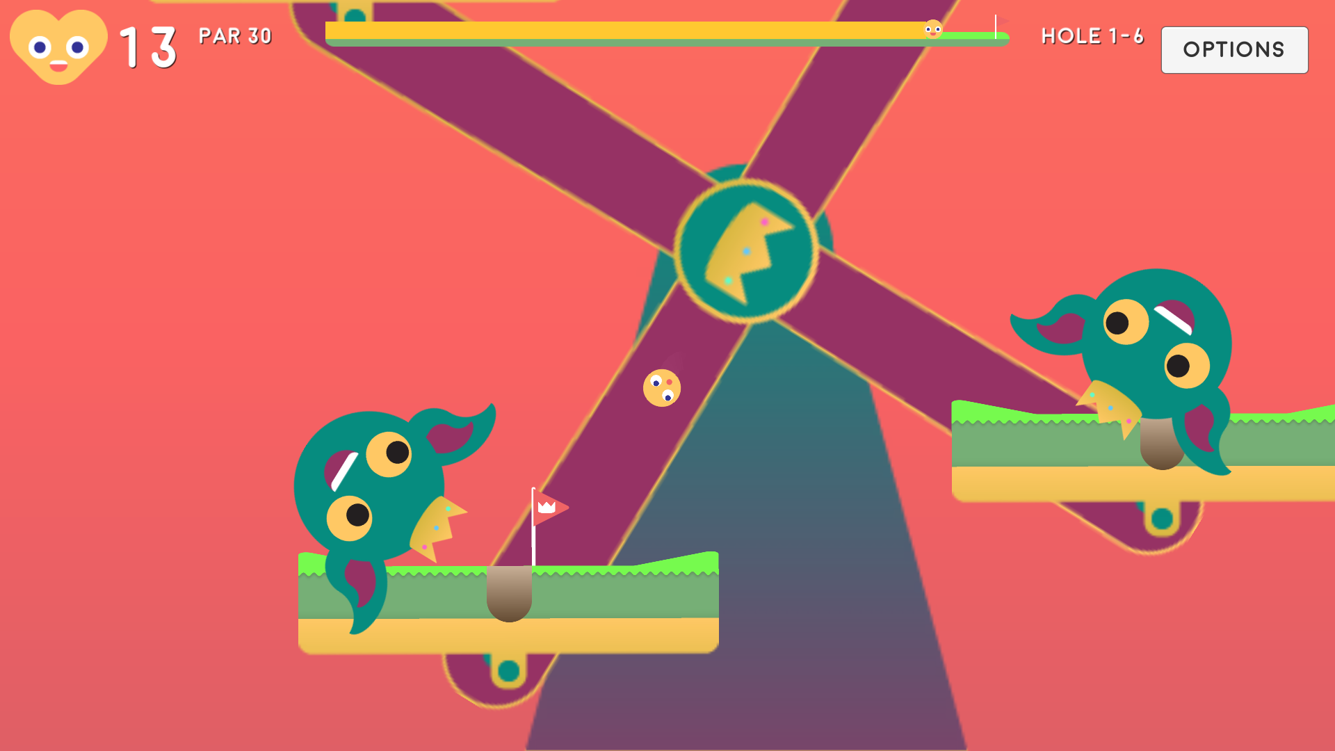
Since the 1.1 update released on the 31/09/17, the game has a final level which was designed to feel more like a boss stage. As this was completed post-release, I won't focus too much on it. In short, this stage was used to explore a few new ideas like longer, more diverse levels with more complex hole locations. Overall, I don't think this level quite feels right sitting alongside the rest, so I would probably look to stay with shorter, more condensed levels as they feel coherent and easier to play again and again.
Conclusion / What did I learn from the experience
I am very happy with how Golf & Goblins ended up as it's a good example of my creative abilities within the realms of game design, as well as being a fun little addictive game. I am also proud in the sense that I was able to make everything for the game within the 2-week deadline so it really feels like a personal project, having done the original concept generation, design, art, coding and even the terrible music!
I'm pleased by how the game feels fairly substantial, far more so than my past prototype efforts. The scope of the project was well judged in terms of time, as well as acknowledging my own technical development limitations; I felt the introduction of a deadline was the main contributor towards that as it focused my efforts and structured my planning. I didn't get around to a lot of the finishing touches I had hoped for, such as designing a world map, but I did wrap the project up nicely with the high-score save system. There is definitely a lot left for me to learn about game design and more specifically coding and Unity too. On that note, I would say Unity is a fantastic program if you are looking to get into game design. It's accessible, free and most importantly it's powerful and portable enough to warrant vast use within the industry.
In summary, I learnt that I can make an enjoyable game that I would play myself. It gives me confidence that I could release a small, yet fully-fledged game and will be looking to do that in the future. That may even be a refined version of Golf & Goblins as I believe the general premise has far more untapped potential. I have also received fairly unanimous positive feedback which made the project a very rewarding experience. Flinging the ball with finger swipes will almost certainly feel more visceral than a mouse so mobile devices may be an ideal home for Golf & Goblins.
Files
Get Golf & Goblins
Golf & Goblins
A Platforming Golf Game.
| Status | Prototype |
| Author | Puchalla |
| Genre | Platformer |
| Tags | 2D, Golf, Puzzle-Platformer |
More posts
- Golf & Goblins Free-To-Play Mobile Re-DesignOct 19, 2017
Leave a comment
Log in with itch.io to leave a comment.